The problem with buttons…
Button alignment should be a fairly simple affair – either they are right or left aligned, however this is a topic which causes much debate as button alignment can be a brand specific, can vary according to content on a page, and can vary depending on what operating system you are working on.
Left Aligned
Buttons that are left aligned make sense as we read from left to right, so to align an action button with the text alignment is visually consistent. The reason why GDS uses left alignment for it’s button placement is to ensure the button is in an area where text is present so that if someone who needs to use a screen magnifier to read the page can easily locate the button as it is where it would be expected (with the text). Examples of this button alignment can be seen on GOV.UK, Facebook and Natwest websites.

Above: GOV.UK’s Tax your vehicle page
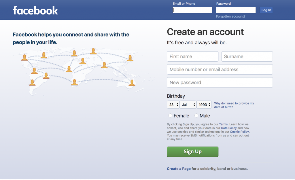
Above: Facebook’s login and create an account page
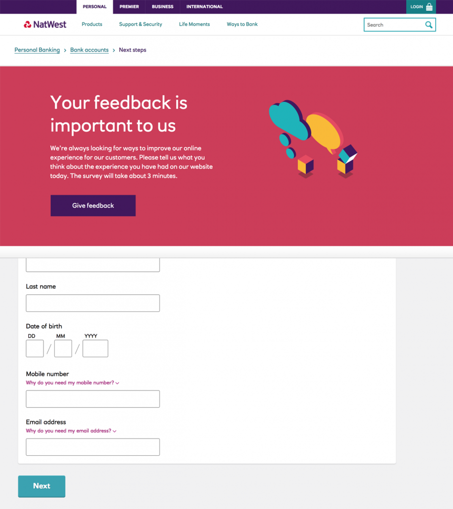
Above: Two of Natwest’s pages showing buttons left aligned with text
Right Aligned
A case for why buttons should be right aligned can also be down to the fact that we read from left to right. This means that our focus begins at the left and ends to the right, therefore it makes sense to place a call to action button at the last focal point on the page. Right aligned call to action buttons make more sense in cases where you need to navigate through multiple pages or dialogs, as ‘Next’ actions would be moving forwards, and ‘Back’ actions would be moving backwards, so aligning these accordingly would make sense from a user’s mental model point of view, for example turning the pages of a book forwards or backwards. Right aligned buttons make more sense on mobile devices as most users are right handed, and their thumb target area is closer to the right than the left.

Above: AXA Insurance has the call to action button right aligned, and pressing this button takes you to the next page

Above: Direct Line Insurance has the call to action button right aligned
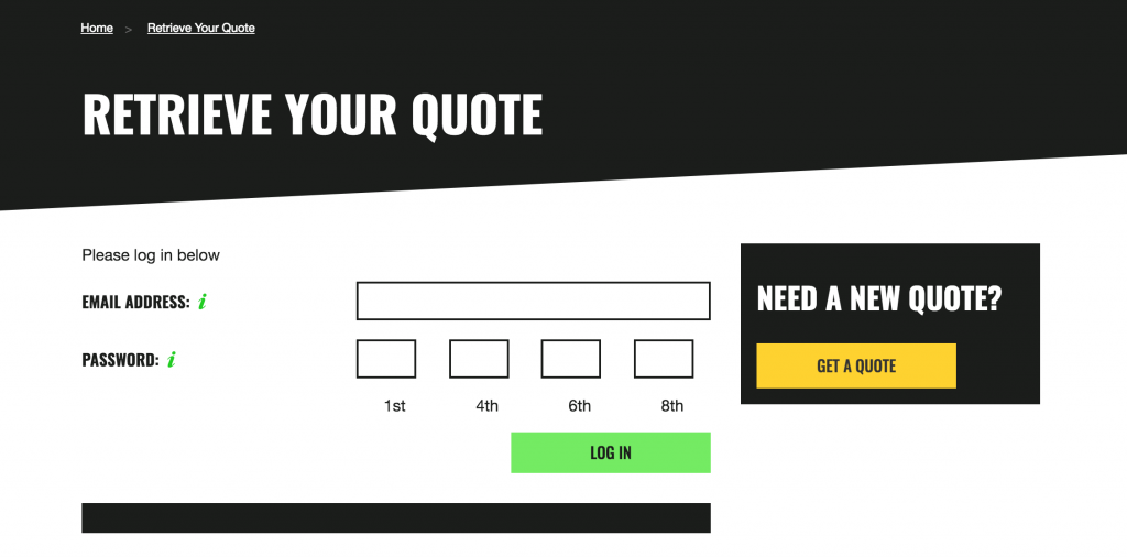
Above: Green Flag with the right aligned button as part of the form, but a left aligned button for ‘Get a Quote’
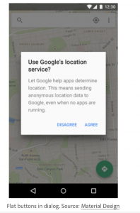
Above: Google Maps on Android has the ‘Agree’ primary action button aligned to the right
Center Aligned
Some brands are setting the trend of using center alignment for their call to action buttons, following a more mobile first design pattern and applying it to desktop views as well.
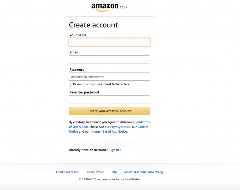
Above: Amazon styles its buttons to be as wide as the input fields and to be center aligned

Above: The Interaction Design Foundation has a sign up wizard pattern, however it breaks the trend by using a center aligned button for ‘Next’

Above: Argos has hidden concertina sections which appear once you press the ‘Save and Continue’ button in each section and this has been aligned to be the full container width of the other elements on the page and center aligned
Windows vs Mac
Button alignments get even more confusing when you step outside of the web and compare software on Windows and on Mac. Take Microsoft Word for example, the Save dialog prompt has the primary action of ‘Save’ placed to the right on Mac, but this is aligned to the left on Windows. More confusingly the ‘Don’t Save’ button is in the middle on Windows, however it is placed to the left on Mac. Dialog prompts are not the only area where this difference occurs – the close and minimise buttons are left aligned on Mac, and are always right aligned on Windows.

So which is the correct way?
There is no correct way – it depends on context. If the majority of your website has text left aligned and nothing spanning over to the right then it makes sense to have your buttons aligned in this manner, if your website follows lots of steps as part of a wizard pattern then you may want to follow the convention of aligning ‘Next’ to the right and ‘Back’ to the left, but ultimately it depends on what your brand guidelines are, and what the outcome of user testing is.