Mathematics in Colour
As much as being a designer requires an eye for detail, an ability to know which colours ‘go together’ and an appreciation for ‘pretty things’ I recently learned something really useful about how mathematical colours really are. Back in school I remember being taught in art how to make different colours by being presented with simple Red, Blue and Yellow and being told to mix them in different quantities to get the other colours which were not primary.
- Red + Yellow = Orange
- Yellow + Blue = Green
- Red + Blue = Purple
But what if I told you this was wrong? Yes these colours are taught to us as the very first colour system we are introduced to as youngsters, however this does not mean it is an effective colour system. To create an effective colour system we need to be aware of how the human eye sees colour and interprets colour information. Within the human eye there are three cone cells which detect coloured light, one detects mostly red light, one detects mostly green light, and the other detects mostly blue light. This doesn’t mean that they only detect these colours though – which is why we can see yellow light through a combination of using our red and green cone cells. It also means if there are deficiencies across some or all of these cones a variety of colour blindness conditions can be created.
RGB and CMY Colour systems
Given the human eyes see colours through cones which detect primarily red, green and blue light it makes more sense for us to use an RGB colour system to define colour values. But what about CMY colours?
RGB is an additive colour system as a light source emits colours together to display a particular colour.When working on websites, apps, and documents which will be used online the RGB system should be used as it works with how monitors display light through a combination of red, green and blue streams of light.
CMY (also called CMYK – the K stands for Key or black) is a subtractive colour system, as the colours are created by absorbing the opposite colour and reflecting the intended colour from the paper. It is used for printed documents, painting and inks. The primary colours in this system are Cyan, Magenta and Yellow as these are the opposite of red, green and blue and since the colours to be seen will be reflected, rather than emitted this is a more effective colour system for printed products.
This is why by default, if you use Photoshop or Illustrator’s predefined templates to create a new document if you choose a template under the ‘Web” section you will be presented with an RGB document, and if you select a template under the ‘Print’ section you will be presented with a CMYK document.
Hexadecimal Colours
When I started learning about how to code up colours in web design, I became familiar with the hexadecimal colour scheme which seemed like voodoo to begin with – a hexadecimal value which represented a colour was all well and good, but I found myself using a colour picker to figure out what this colour would look like and then look up the hex code afterwards. It wasn’t intuitive for a designer to use to explore different colour schemes. This is how the hex code system relates to colour;
What is a hex code?
A hex code (hexadecimal code) is a six digit number made up of triplets. Each byte (group of two alphanumeric characters) represents a value between 0-255. Byte 1 is the quantity of red, byte 2 is the quantity of green and byte 3 is the quantity of blue as show in the below diagrams;
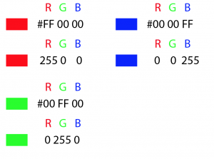
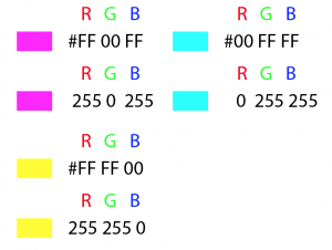
Since RGB is an additive colour system, if we have a hex value of #000000 then no light is present, so the colour will be black, and if we have a hex value of #FFFFFF then all colours are present which creates white.
HSB Colour System
Yes, another colour system! The RGB colour system makes sense from a technical point of view, however from a design point of view the HSB colour system is much easier to play with to get different colour schemes and variations based on the RGB system. It is also a good system to use in design programs such as Photoshop or Illustrator as you will be able to have more control over the kind of colour palettes you can create.
What is HSB?
HSB is basically Hue, Saturation and Brightness.
- Hue – this is the colour on the colour wheel. The colour wheel is a circle, so hue is measured in degrees.
- Saturation – this is how rich the colour is, or how much colour is injected into your hue.
- Brightness – this is how much brightness is injected into the hue.
The Hue colour wheel
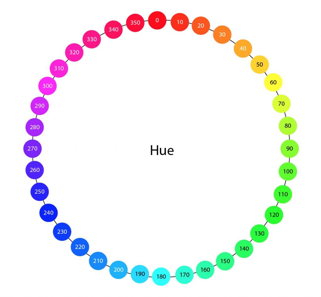
Above illustrates the different hues in the colour wheel and their representative values. This illustration shows increments of 10 degrees, however the colour wheel covers each value from 0-360 degrees.
The Hue and Brightness colour wheel
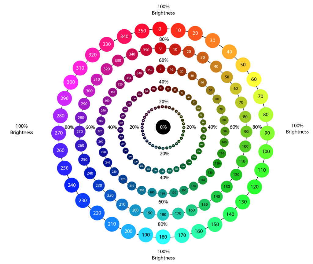
In the above illustration the hue of each colour remains the same, however the brightness value changes incrementally from 100% brightness to 0% brightness. Decreasing the brightness creates a darker version of the colour on the colour wheel. For the purpose of this chart the saturation remains at 100%.
The Hue and Saturation colour wheel

In the above illustration the hue remains the same, but the saturation value changes incrementally from 100% saturation to 0%. For the purpose of this chart the brightness remains at 100%. Decreasing the saturation creates a less rich, pastel version of the colour.
Why use this colour system?
HSB can be useful when trying to come up with variations of colours, or colour palettes for brands or products. By understanding what hue, saturation and brightness are, you can play around with these values mathematically and get some really interesting palettes. Here are some examples;

Notice that in the examples above the hue remains the same, but the colour variations are achieved by altering the hue and saturation.
![]()
In the above example by increasing the saturation by 20% while at the same time decreasing the brightness 20% this achieves a bolder primary colour and a secondary more muted colour. This is a good way of exploring options for enabled/disabled colour combinations, or for a bold primary colour and an alternative paler version.
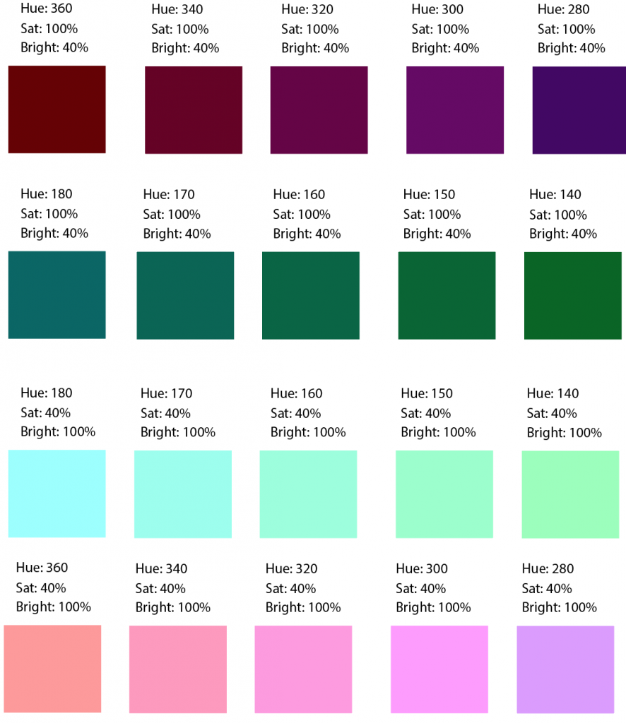
In the example above the colour red (360) was chosen as a starting point, then a sequence of colours was created by doing the following;
- Start at a hue of 360 and reduce it by 20 each time (to get 360, 340, 230, 300 and 280)
- For the darker colours keep the saturation (100%) and brightness (40%) the same
- For the second row of darker colours, halve the hue number to get an alternative colour (360/2 = 180)
- For the paler colours, use the same method as before however invert the saturation and brightness so saturation is 40% and brightness is 100%
The Google example
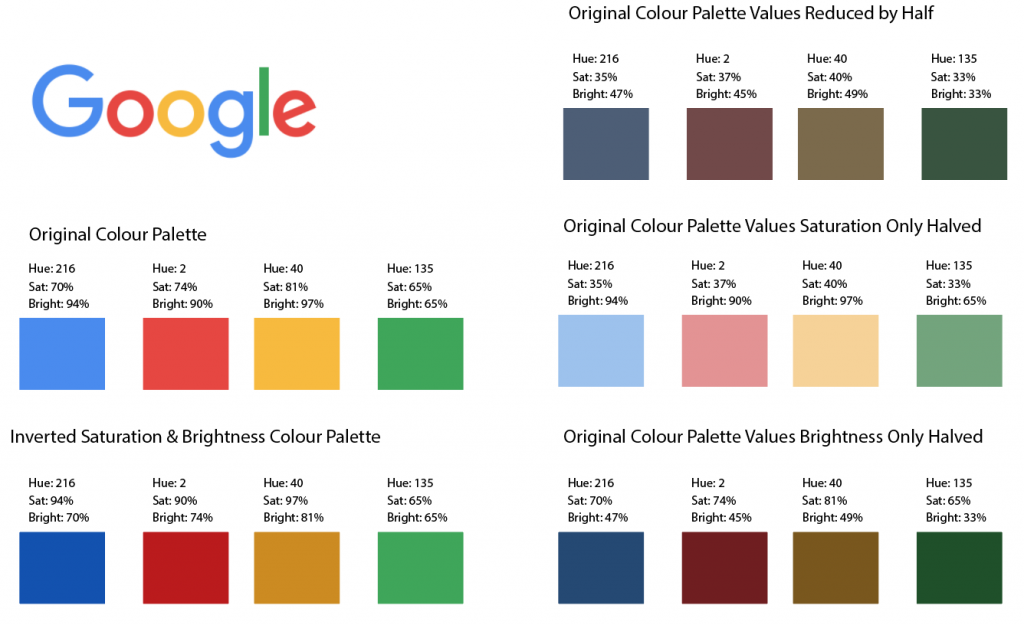
Above shows the Google logo and the original colour palette used for this. The additional examples illustrate how you can give different variations to this colour set by altering the brightness and saturation values without amending the actual colour selection.
I hope you enjoyed reading about colour as much as I did researching the topic. Take a look at the further reading links to find the original articles where I sourced my information. The illustrations featured in this article were created by me experimenting in Illustrator.