Accessibility issues with placeholder text
What is placeholder text?
Placeholder text is where content is added to a text box in order to prompt the user of the type of data we are expecting them to input.
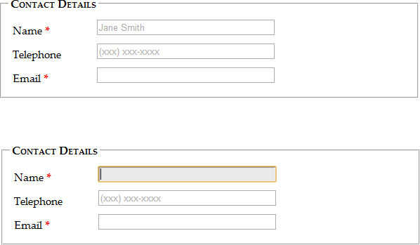
In the following example placeholder text is added to the Name and Telephone fields to not only indicate what kind of input is expected, but also in the case of the telephone number what format is required;

In the following example placeholder text indicates the input expected, however it also serves as being the label for the input box as well;

Why placeholder text can cause accessibility issues
While the intention of providing example input format to the user can be useful to avoid invalid data entry, the implementation of this assistance is not best delivered through the use of placeholder text. The following list describes some accessibility concerns in regards to using placeholder text;
- Screen readers can have difficulty reading them.
- Placeholder text is subject to colour contrast ratios as it is an active user component, however darkening the contrast ratio may cause confusion as text appears filled in.
- Using placeholder text is bad for usability as you are reliant on the user’s short term memory for the hint on what the content should be. Once this content has been typed into the hint has disappeared from view.
- You can introduced errors by having placeholder content which does not delete automatically as the user may combine their text entry with the placeholder text.
- The form becomes more difficult to scan as the eyes are naturally drawn to empty fields – placeholder text gives the false impression that content is already populated.
Recommended alternatives
While it is a great aid to the user to provide example data as expected in the field, placeholder text is not the best implementation to present this. Instead it is recommended to use hint text instead of placeholder text as this is always on the screen and does not disappear from view once you begin typing;


